Why There Won’t Be a Recession That Tanks the Housing Market
There’s been a lot of recession talk over the past couple of years. And that may leave you worried we’re headed for a repeat of what we saw back in 2008. Here’s a look at the latest expert projections to show you why that isn’t going to happen.
According to Jacob Channel, Senior Economist at LendingTree, the economy’s pretty strong:
“At least right now, the fundamentals of the economy, despite some hiccups, are doing pretty good. While things are far from perfect, the economy is probably doing better than people want to give it credit for.”
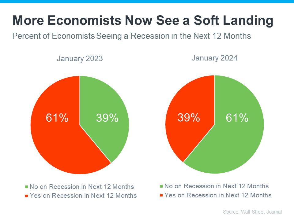
That might be why a recent survey from the Wall Street Journal shows only 39% of economists think there’ll be a recession in the next year. That’s way down from 61% projecting a recession just one year ago (see graph below):
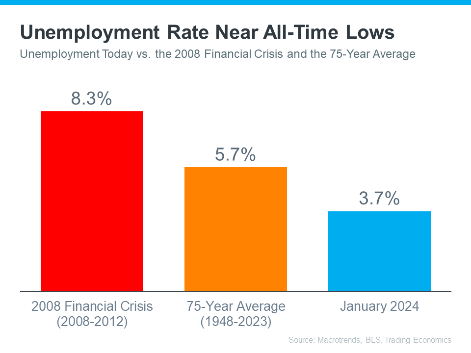
Most experts believe there won’t be a recession in the next 12 months. One reason why is the current unemployment rate. Let’s compare where we are now with historical data from Macrotrends, the Bureau of Labor Statistics (BLS), and Trading Economics. When we do, it’s clear the unemployment rate today is still very low (see graph below):
The orange bar shows the average unemployment rate since 1948 is about 5.7%. The red bar shows that right after the financial crisis in 2008, when the housing market crashed, the unemployment rate was up to 8.3%. Both of those numbers are much larger than the unemployment rate this January (shown in blue).
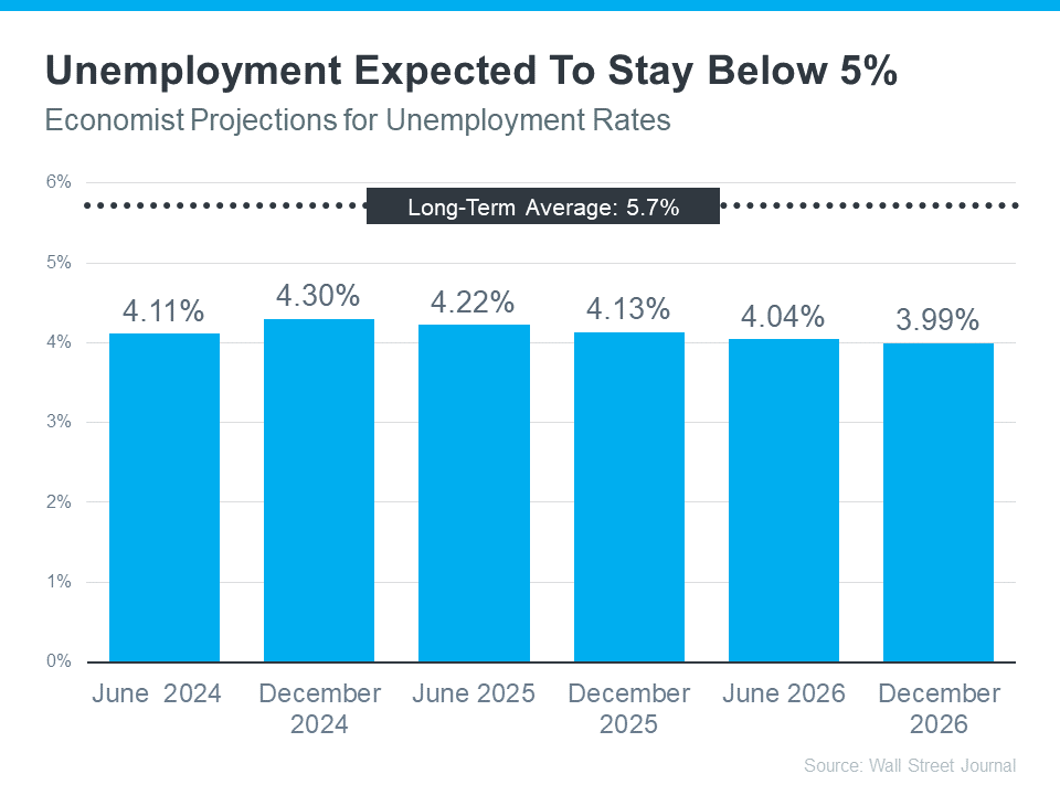
But will the unemployment rate go up? To answer that, look at the graph below. It uses data from that same Wall Street Journalsurvey to show what the experts are projecting for unemployment over the next three years compared to the long-term average (see graph below):
As you can see, economists don’t expect the unemployment rate to even come close to the long-term average over the next three years – much less the 8.3% we saw when the market last crashed.
Still, if these projections are correct, there will be people who lose their jobs next year. Anytime someone’s out of work, that’s a tough situation, not just for the individual, but also for their friends and loved ones. But the big question is: will enough people lose their jobs to create a flood of foreclosures that could crash the housing market?
Looking ahead, projections show the unemployment rate will likely stay below the 75-year average. That means you shouldn’t expect a wave of foreclosures that would impact the housing market in a big way.
Bottom Line
Most experts now think we won’t have a recession in the next year. They also don’t expect a big jump in the unemployment rate. That means you don’t need to fear a flood of foreclosures that would cause the housing market to crash.
The following analysis of select counties of the Western Washington real estate market is provided by Windermere Real Estate Chief Economist Matthew Gardner. We hope that this information may assist you with making better-informed real estate decisions. For further information about the housing market in your area, please don’t hesitate to contact me.
REGIONAL ECONOMIC OVERVIEW
The post-COVID job recovery continues. Though data showed the number of jobs dropped in January, February saw gains that almost offset the jobs lost the prior month. As of February (March data is not yet available), the region had recovered all but 47,000 of the more than 300,000 jobs lost due to the pandemic. Of note is that employment levels in Grays Harbor, Thurston, San Juan, and Clallam counties are now above their pre-pandemic levels. In February, the regional unemployment rate rose to 4.1% from 3.7% in December. Although this may be disconcerting, an improving economy has led more unemployed persons to start looking for a job, which has pushed the jobless rate higher. I expect the regional economy to continue expanding as we move into the spring and summer, with a full job recovery not far away.
HOME SALES
In the first quarter of 2022, 15,134 homes sold, representing a drop of 5.8% from the same period a year ago, and down 31.7% from the fourth quarter.
Yet again, supply-side constraints limited sales. Every county except Snohomish showed lower inventory levels than a year ago.
Sales grew in five counties across the region but were lower across the balance of the counties contained in this report. Compared to the fourth quarter, sales were lower across all market areas.
The ratio of pending sales (demand) to active listings (supply) showed pending sales outpacing listings by a factor of 6.7. Clearly, the significant jump in mortgage rates in the first quarter has not yet impacted demand. Rather it appears to have stimulated buyers partly due to FOMO (Fear of Missing Out)!
HOME PRICES
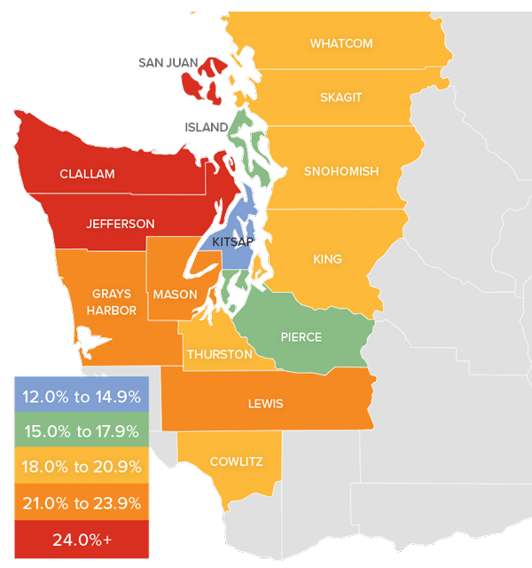
Although financing costs have jumped, this has yet to prove to be an obstacle to buyers, as prices rose 16.4% year-over-year to an average of $738,152. Naturally, there is a lag between rates rising and any impact on market prices. It will be interesting to see what, if any, effect this has in the next quarter’s report.
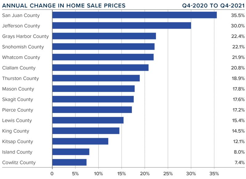
Compared to the same period a year ago, price growth was again strongest in San Juan County, but all markets saw prices rising more than 10% from a year ago.
Relative to the final quarter of 2021, all but Kitsap (-2.7%), Mason (-1.5%), Skagit (-1.8%), Jefferson (-6.3%), and Clallam (-0.1%) counties saw home prices rise.
The market remains supply starved. While increases in “new” listings suggest that more choice is coming to market, it remains insufficient to meet demand.
MORTGAGE RATES
Average rates for a 30-year conforming mortgage were 3.11% at the end of 2021, but since then have jumped over 1.5%—the largest increase since 1987. The surge in rates is because the market is anticipating a seven- to eight-point increase from the Federal Reserve later this year.
Because the mortgage market has priced this into the rates they are offering today, my forecast suggests that we are getting close to a ceiling in rates, and it is my belief that they will rise modestly in the second quarter before stabilizing for the balance of the year.
DAYS ON MARKET
It took an average of 25 days for a home to go pending in the first quarter of 2022. This was 4 fewer days than in the same quarter of 2020, but 2 days more than in the fourth quarter of 2021.
Snohomish, King, and Pierce counties were the tightest markets in Western Washington, with homes taking an average of 11 to 15 days to sell. The greatest drop in market time compared to a year ago was in San Juan County, where it took 23 fewer days for homes to sell.
All but five counties saw average time on market drop from the same period a year ago, but the markets where it took longer to sell a home saw the length of time increase only marginally.
Quarter over quarter, market time dropped in Snohomish, King, and Pierce counties. Jefferson and Clallam counties also saw modest improvement. In the balance of the region the length of time a home was on the market rose, but seasonality undoubtedly played a part.
CONCLUSIONS
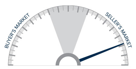
This speedometer reflects the state of the region’s real estate market using housing inventory, price gains, home sales, interest rates, and larger economic factors.
The numbers have yet to indicate that demand is waning amid rising interest rates, but this is sure to become a greater factor as we move into the spring. A leading indicator I pay attention to is changes to list prices and, in most counties, these continue to increase. This suggests that sellers remain confident they will be able to find a buyer even in the face of higher borrowing costs. If this pace of increase starts to soften, it may be an indication of an inflection point, but it does not appear to be that way yet.
Given all the factors discussed above, I have decided to leave the needle in the same position as the last quarter. The market still heavily favors sellers, but if rates rise much further, headwinds will likely increase.
As Chief Economist for Windermere Real Estate, Matthew Gardner is responsible for analyzing and interpreting economic data and its impact on the real estate market on both a local and national level. Matthew has over 30 years of professional experience both in the U.S. and U.K.
In addition to his day-to-day responsibilities, Matthew sits on the Washington State Governors Council of Economic Advisors; chairs the Board of Trustees at the Washington Center for Real Estate Research at the University of Washington; and is an Advisory Board Member at the Runstad Center for Real Estate Studies at the University of Washington where he also lectures in real estate economics.
The following analysis of the Western Washington real estate market is provided by Windermere Real Estate Chief Economist Matthew Gardner. We hope that this information may assist you with making better-informed real estate decisions. For further information about the housing market in your area, please don’t hesitate to contact me.
REGIONAL ECONOMIC OVERVIEW
Just when we thought COVID was starting to pull back, the Omicron variant made its presence known. It is still too early to suggest that this has affected the region’s economic recovery—we won’t likely know for certain until we get more job data. I remain hopeful that this latest spike in infections will not have too much of an impact, but only time will tell. To date, the region has recovered all but 51,000 of the 297,000 jobs that were lost due to the pandemic. Some of the region’s smaller counties, including Grays Harbor, Cowlitz, Thurston, San Juan, and Clallam, have seen a full job recovery. The most recent data (November) shows the regional unemployment rate at a very respectable 3.3%, which is below the pre-pandemic low of 3.7%. The lowest unemployment rates were in King and San Juan Counties, where 2.9% of the labor force was out of work. The highest rate was in Grays Harbor County, which registered 5.1%. I still expect to see a full job recovery by this summer. However, there is a growing labor shortage holding the area back. Hopefully, this will change, but some industry sectors—especially hospitality—continue to find it hard to attract workers.
WESTERN WASHINGTON HOME SALES
❱ In the final quarter of the year, 22,161 homes sold, representing a drop of 5.2% compared to the same period in 2020 and down 18.8% from the third quarter.
❱ The reason there were lower year-over-year sales is simply because the number of homes for sale was down more than 30%. The drop between third and fourth quarters is likely due to seasonality changes in the market.
❱ Although home sales were lower in most markets, there was a significant uptick in Grays Harbor and Thurston counties. The number of homes sold dropped across the board compared to the third quarter.
❱ The ratio of pending sales (demand) to active listings (supply) showed sales outpacing listings by a factor of 5.2. The market is supply starved and unfortunately, it’s unlikely enough homes will be listed this spring to satisfy demand.
WESTERN WASHINGTON HOME PRICES
❱ Home prices rose 15.1% compared to a year ago, with an average sale price of $711,008. This was 2.1% lower than in the third quarter of 2021.
❱ When compared to the same period a year ago, price growth was strongest in San Juan and Jefferson counties. All but two markets saw prices rise more than 10% from a year ago.
❱ Relative to the third quarter, every county except Island (-8.6%), Mason (-5.2%), Lewis (-2.9%), King (-2.1%), Cowlitz (-1.7%), and Kitsap (-0.9%) saw sale prices rise.
❱ Mortgage rates rose more than .2% between the third and fourth quarters, which may have impacted prices. Affordability constraints continue to grow, which is also likely to have played a part in slowing gains.
DAYS ON MARKET
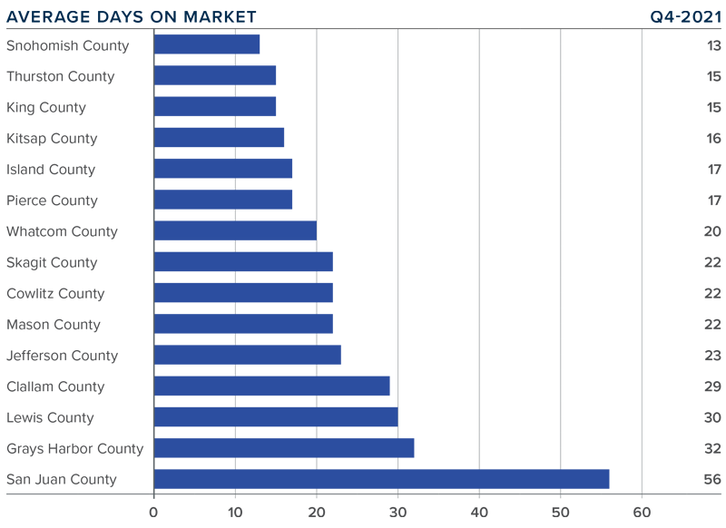
❱ It took an average of 23 days for homes to sell in the final quarter of 2021. This was 8 fewer days than in the same quarter of 2020, but 6 more days than in the third quarter of last year.
❱ Snohomish, Thurston, King, and Kitsap counties were the tightest markets in Western Washington, with homes taking an average of between 13 and 16 days to sell. The greatest drop in market time compared to a year ago was in San Juan County, where it took 33 fewer days for a seller to find a buyer.
❱ All counties contained in this report saw the average time on market drop from the same period a year ago. Every county except Whatcom saw market time rise compared to the third quarter.
❱ Longer days on market might suggest that things are starting to slow, but I don’t actually think this is the case. I believe buyers are being a little more selective before making offers, and many may be waiting in the hope that supply levels will improve in the spring.
CONCLUSIONS
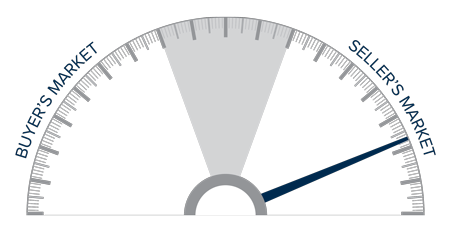
This speedometer reflects the state of the region’s real estate market using housing inventory, price gains, home sales, interest rates, and larger economic factors.
The housing market remains in a state of imbalance, but, as I look at the data, I believe the frenetic pace of sales and price appreciation may start to soften in 2022.
This will likely be due to financing costs and affordability acting as headwinds to price growth. Mortgage rates have started to rise again, and I have forecasted them to reach 3.7% by fourth quarter. This alone will slow price growth as affordability in many areas declines.
One thing that remains unknown that could have a significant impact on the market is long-term work-from-home policies. Many businesses have not yet determined their plans for remote working, but once they do, potential home buyers who have been waiting to see how frequently they have to commute to work could immediately start their search. In addition to boosting sales, this could add inventory to the market as well.
All things considered, I am moving the needle just a notch toward buyers. However, as you can see, we are still in a market that heavily favors home sellers.
ABOUT MATTHEW GARDNER
As Chief Economist for Windermere Real Estate, Matthew Gardner is responsible for analyzing and interpreting economic data and its impact on the real estate market on both a local and national level. Matthew has over 30 years of professional experience both in the U.S. and U.K.
In addition to his day-to-day responsibilities, Matthew sits on the Washington State Governors Council of Economic Advisors; chairs the Board of Trustees at the Washington Center for Real Estate Research at the University of Washington; and is an Advisory Board Member at the Runstad Center for Real Estate Studies at the University of Washington where he also lectures in real estate economics.
For further information about the housing market or discuss real estate in your area, please don’t hesitate to contact me.
This video is the latest in our Monday with Matthew series with Windermere Chief Economist Matthew Gardner. Each month, he analyzes the most up-to-date U.S. housing data to keep you well-informed about what’s going on in the real estate market.
Hello there! I’m Windermere Real Estate’s Chief Economist, Matthew Gardner, and welcome to the latest episode of Mondays with Matthew.
Before I get started, I wanted to let you know that this will be the final episode of Monday with Matthew for 2021 as I’m going to be taking Christmas off. So it’s time to offer you my forecasts for the U.S. economy and the country’s housing market in 2022.
Although many people – including myself – had hoped that COVID-19 would have become a somewhat distant memory by now, and that the economy would have recovered this was – sadly – not to be the case, and the pandemic’s influence on the economy is still being felt and all the datasets I track tell me that, although we are certainly healing, COVID continues to act as a drag on economic growth and I expect that to continue through the spring of next year – if not a little longer.
Economic Recovery & Growth
And it’s because of this that I – along with many other economists – have spent the last few months lowering our forecasts for economic growth – at least through the middle of 2022. So, let’s look at this a little closer.
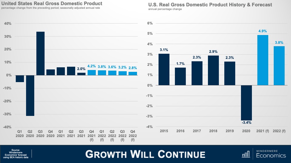
Here is my forecast for economic growth through the end of next year and you will note that, even though I am cautious in regard to the economy as we move through the winter and into 2022, I am still expecting to see a fairly decent bounce back in the fourth quarter of this year following the very disappointing rate that we saw in Q-3.
And on an annualized basis, I believe that the economy will have expanded by just shy of 5% this year and come in a little below 4% in 2022.
Simply put, the impacts of COVID-19 are going to continue to act as a drag on virus sensitive consumer services next year and ongoing supply chain issues will also delay inventory restocking. Both of these impacts have a depressing effect, in more ways than one, on economic growth, but I don’t see any chance that we will fall back into a recession.
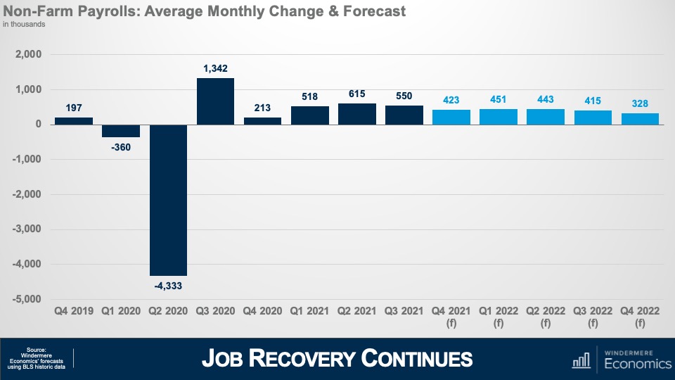
Looking at the employment picture this chart shows my forecast for average monthly growth in jobs during a quarter and to give you some context, over the last decade or so the country has added an average of around 200,000 jobs per month during any one quarter and my forecast is for more robust employment growth as we move through 2022 and, if correct, I expect to see the country return to pre-COVID employment levels in the second half of the year.
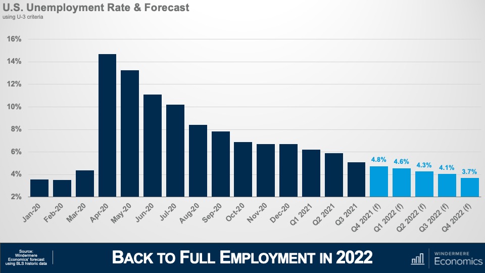
And with jobs continuing to return I’m looking for the unemployment rate to continue trending lower and breaking south of 4% during the final quarter of the year. With the expiration of enhanced unemployment benefits – in concert with wages rising significantly in many face-to-face industries such as leisure and hospitality – prospects for people currently unemployed are looking rather good. That said, there are still millions of unemployed Americans who are not looking for work even with wages rising, the labor force still down by 3 million from its pre-pandemic peak, and this is worrying as businesses continue to have a hard time finding employees which raises the expectation that inflation will remain higher for longer than I would have liked to see.
Measures of Inflation
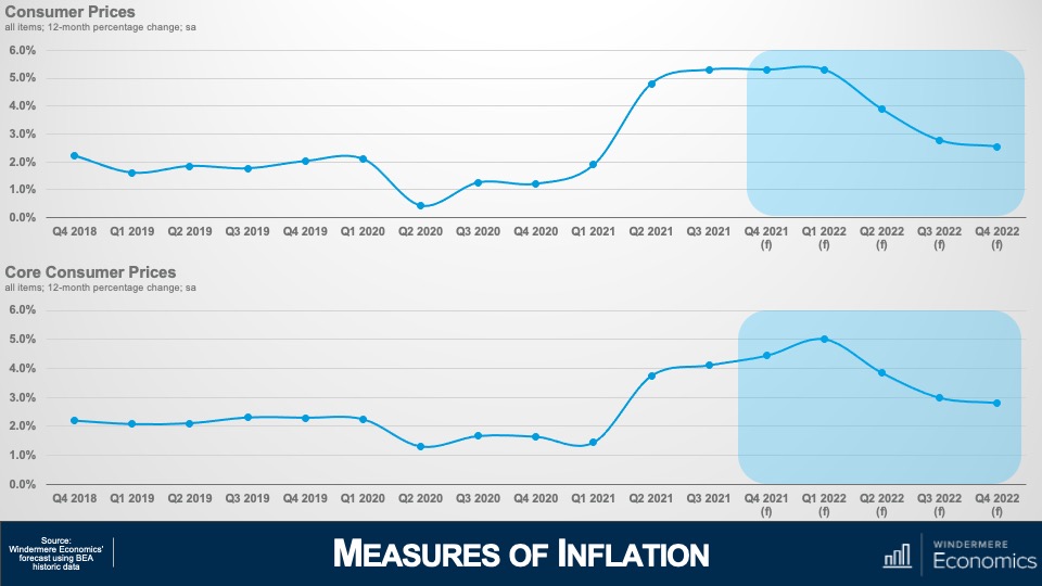
And that leads nicely into my final economic forecast and that is my outlook for inflation. As we have discussed, supply chain issues and labor shortages have increased prices significantly and this top chart shows annual changes in all consumer prices which I expect to remain around 5% until next spring, before gradually dropping down to below 3% by the end of the year.
But the core inflation rate – which excludes the volatile food and energy sectors – won’t peak until early next year before it too starts to gradually pull back and, at these levels, the Federal Reserve will undoubtedly have started to raise interest rates to counteract inflationary pressures. This is not pretty, but I absolutely do not believe that we are in some sort of inflationary spiral, or that “stagflation” will raise its ugly head again.
U.S. Housing Market
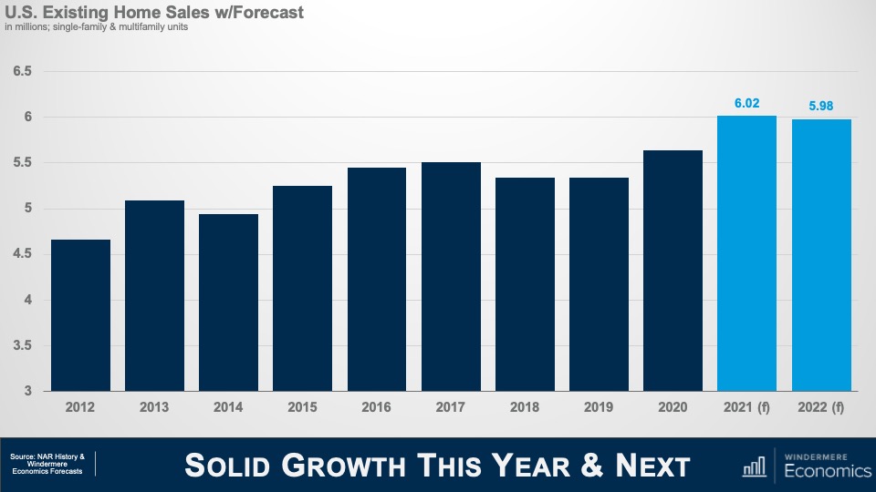
Okay! Now it’s time to turn our attention to the U.S. housing market which was a beacon of hope during the pandemic period and, given the massive spike in demand that started last June, I’m looking for a little more than 6 million existing homes will have changed hands in 2021, but I don’t see this level increasing in 2022 – mainly due to ongoing supply limitations as well as rising affordability issues, and I’m therefore forecasting sales to pull back – albeit very modestly – next year. That said, the country has never seen more than 6 million home selling in a single year since records were first kept so the number is still very impressive.
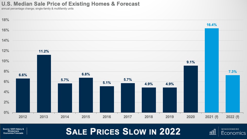
And with the market as tight as it has been so far this year, it shouldn’t be any surprise to see median sale prices skyrocketing and, even though we have 3 more months of sales data yet to be released, I still anticipate prices will have risen by almost 16 and a half % in 2021- a quite remarkable number. This pace of appreciation has never been seen before. In fact, the closest was back in 2005 – when the housing bubble was inflating rapidly – but even then, prices only rose by 12.2%.
But, as I mentioned in my sales forecast, this pace of growth is unsustainable and I am expecting to see some of the heat to come off the market next year but, a growth rate of 7.3% is certainly nothing to sniff at.
There are three major reasons why we will see the pace of growth slow. I have already mentioned my concerns regarding housing affordability, but mortgage rates and new supply will both influence the slowdown in sales and price growth in the resale arena.
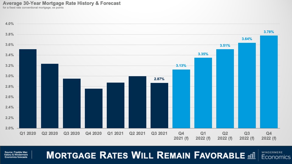
Although I do not prepare a forecast for housing affordability, this is my where I expect to see mortgage rates through the end of next year and I am looking for them to continue “stair-stepping” higher but still ending 2022 below 4% – very low by historic standards given that the long-term average for a conventional 30-year mortgage is somewhere around 7 1/2%.
Obviously, as rates notch higher that starts to compress price growth as it puts a lower ceiling on how much a buyer can afford to pay for a home.
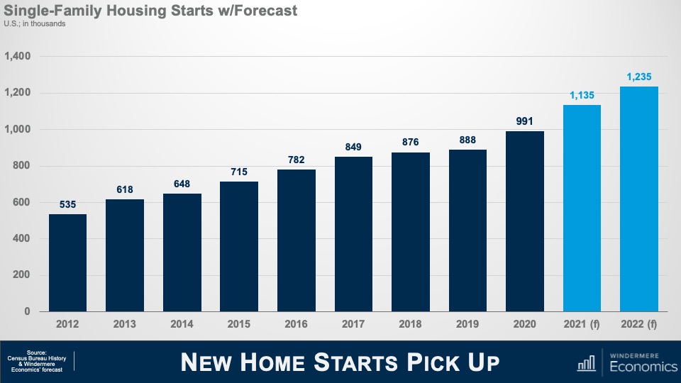
And slowing growth in existing home prices and sales will also be a function of additional supply and this chart shows my forecast for single-family starts this year and next. I expect more than a million homes to start construction in 2022 – continuing the trend that started in mid-2020 – but I am sure that some of you may be asking yourselves that if starts are already robust, how have existing home sales been able to increase so significantly if there has been solid supply coming from homebuilders – and that would be a great question.
And I would answer this by telling you that the way the Census gathers data on start is to count the number of home foundations that have been poured, but vertical construction has not necessarily started. And what we have been seeing is a lot of foundations but not so many homes actually being built – and we know this by looking at the number of homes that are for sale but have yet to be started. So, it’s important to look at a separate number that the Census Bureau also puts out which counts the number of units actually under construction, and that number has been growing significantly over the course of the last 18 months or so.
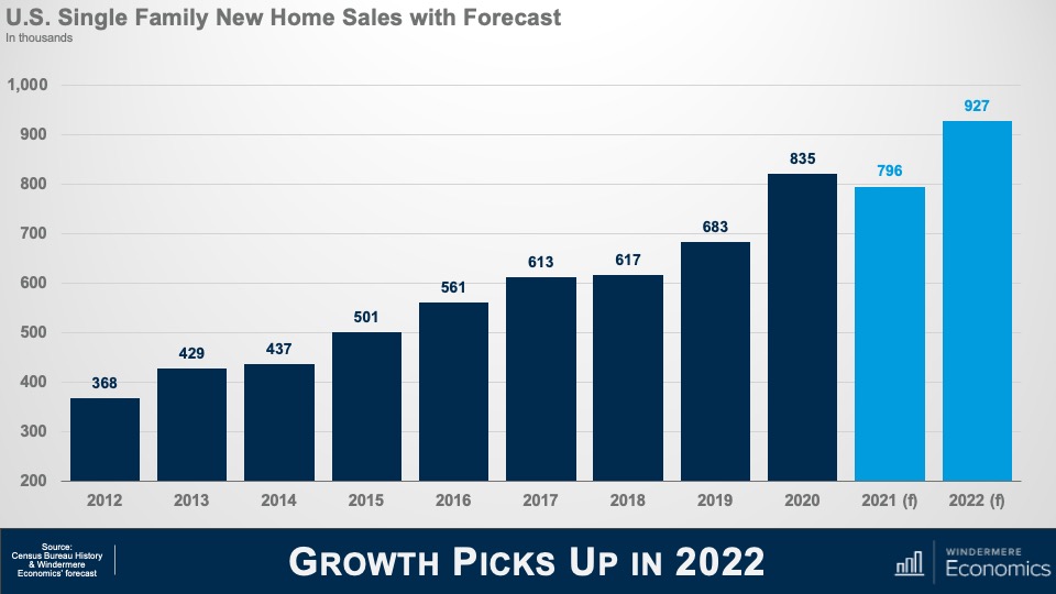
Builders have been hamstrung with rising labor and material costs which will lead new home sales this year to fall below the number seen in 2020; however, I do expect this to pick up significantly next year and my current forecast calls for 927,000 new homes to be sold in 2022.
So, there you have it, my economic and housing market forecast for 2022.
Of course, there are still a number of variables that could lead me to revise this forecast but, as an old economics professor of mine used to tell me, “Gardner, forecast well, but forecast often!”
If everything goes according to my plan, you should expect to see the housing market start to move towards some sort of balance next year, but I am afraid that it will still remain out of equilibrium until at least 2023.
And if you’re wondering, no, I don’t see a housing bubble forming and I’m also not at all concerned about homeowners currently in forbearance, but it would be silly to say that there aren’t any issues in the housing market that concern me because there are and the biggest of which is housing affordability and this will have a significant impact on the millennial generation who are continuing to get older, and they are all – well most – thinking about settling down and, possibly, having children, and I wonder how hard it will be for many of them to be able to afford to buy their first home because most really do want to become homeowners. Will builders figure out how to build to this massive pent-up demand? I guarantee you that whoever can solve this puzzle will do very, very well.
COVID-19 caused an unparalleled shock to the US economy and the rise of the delta variant has certainly impacted the speed of our recovery but, rest assured, this particular forecaster firmly believes that we will recover and that the economy will continue to grow.
Demand for ownership housing remains remarkably buoyant and, in fact, it is quite likely that demand may actually increase with the work from home paradigm that will start to gain momentum next year. It will be fascinating to watch how this impacts not just demand, but where these buyers will ultimately choose to live.
In closing, I very much hope that you have all enjoyed the videos that I have shared this year as much as I have enjoyed making them.
As always if you have any questions or comments about this topic, please do reach out to me but, in the meantime, stay safe out there and I look forward the visiting with you all again next year.
The following analysis of the Western Washington real estate market is provided by Windermere Real Estate Chief Economist Matthew Gardner. We hope that this information may assist you with making better-informed real estate decisions. For further information about the housing market in your area, please don’t hesitate to contact your Windermere Real Estate agent.
REGIONAL ECONOMIC OVERVIEW
The emergence of the of COVID-19 Delta variant had a palpable impact on the region’s economy, which, naturally, impacted the job recovery. Employment levels in Western Washington had been picking up steam in the spring but started to slow quite dramatically over the summer. To date, the region has recovered more than 201,000 of the jobs that were lost due to the pandemic, but we appear to be in a bit of a holding pattern. That said, the ending of enhanced unemployment benefits has led many business owners to see more applicants for open positions, so I am hopeful the numbers will pick back up as we move into the winter months. The most recent data (August) shows the region’s unemployment rate at a respectable 5%, but we still have a way to go before we reach the pre-pandemic low of 3.7%. On a county level, the lowest unemployment rate was in Kitsap County (4.4%) and the highest was in Grays Harbor County (6.6%). There are still many hurdles in front of us, but I believe we will continue to add jobs and reach full employment recovery by mid-2022.
WESTERN WASHINGTON HOME SALES
❱ Sales in the third quarter rose 6.4% year over year, with a total of 27,280 homes sold. The increase matched what we saw in the second quarter of this year.
❱ I was pleased to see sales growth continue. This rise was supported by a 28.4% increase in the number of homes for sale. Listings rose the most in Grays Harbor (+62.6%), Lewis (+53.6%), and Skagit (+52.0%) counties.
❱ Sales activity was mixed. Nine counties saw year-over-year growth, but sales slowed in six counties. That said, sales were up in every county other than King and San Juan compared to the second quarter of 2021.
❱ The ratio of pending sales (demand) to active listings (supply) showed pending sales outpacing listings by a factor of 4.6. Even with the increase in the number of new listings, the market is far from balanced.
WESTERN WASHINGTON HOME PRICES
❱ Home prices rose 18.9% compared to a year ago, with an average sale price of $726,168—another all-time record.
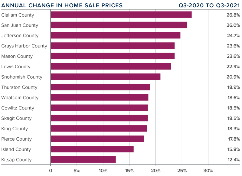
❱ When compared to the same period a year ago, price growth was strongest in Clallam, San Juan, and Jefferson counties, but all markets saw prices rise more than 12% from a year ago.
❱ Average sale prices pulled back 1.1% compared to the second quarter of this year. Given the massive increase in value over the past few years, it is not at all surprising. The key indicator has been a softening in list prices and that naturally translates to slower price growth. This is nothing to be worried about. It simply suggests that the market may finally be heading back to some sort of balance.
❱ Relative to the second quarter of this year, all counties except San Juan (-0.1%), Island (-0.5%), and Whatcom (-0.5%) saw higher sale prices.
DAYS ON MARKET
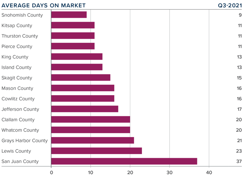
❱ It took an average of 17 days for a home to sell in the third quarter. This was 19 fewer days than in the same quarter of 2020, and 1 fewer day than in the second quarter of this year.
❱ Mirroring the second quarter, Snohomish, Kitsap, Thurston, and Pierce counties were the tightest markets in Western Washington, with homes taking an average of 9 days to sell in Snohomish County and 11 days in the other three counties. The greatest reduction in market time compared to a year ago was in San Juan County where it took 102 fewer days for homes to sell.
❱ All counties contained in this report saw the average time on market drop from the same period a year ago, but eight counties saw market time rise from the second quarter; however, the increases were minimal.
❱ Even with inventory levels increasing in most markets, the region’s housing market remains remarkably tight. That said, I do see some of the heat dissipating and I am hopeful that if inventory levels continue rising, we will start a slow move back toward a balanced market.
CONCLUSIONS
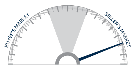
This speedometer reflects the state of the region’s real estate market using housing inventory, price gains, home sales, interest rates, and larger economic factors.
Even given the speedbump that hit the region’s economy with the emergence of the Delta variant, the housing market remains remarkably resilient. Demand from buyers continues to be very strong, and modestly increasing inventory levels appear to have—at least for the time being—reduced some of the fever from the market. Mortgage rates remain very favorable, and my current forecast is for them to stay in the low- to mid-3% range until next summer. Rising inventory levels have led price growth to slow and days on market to start increasing, which may be a sign that the market is retreating from a prolonged period of exuberance.
As we move through the balance of the year, I believe demand will remain solid, but we will continue to see price growth soften as more listings compete for the buyers that are out there. That is not to say price growth will turn negative; rather it suggests that we are slowly moving back toward a more balanced market. That said, the market certainly still favors home sellers. As such, I am leaving the needle in the same position as the second quarter. I may move it a little in the direction of buyers next quarter if the current trend continues through the winter months.
ABOUT MATTHEW GARDNER
As Chief Economist for Windermere Real Estate, Matthew Gardner is responsible for analyzing and interpreting economic data and its impact on the real estate market on both a local and national level. Matthew has over 30 years of professional experience both in the U.S. and U.K.
In addition to his day-to-day responsibilities, Matthew sits on the Washington State Governors Council of Economic Advisors; chairs the Board of Trustees at the Washington Center for Real Estate Research at the University of Washington; and is an Advisory Board Member at the Runstad Center for Real Estate Studies at the University of Washington where he also lectures in real estate economics.
This video is the latest in our Monday with Matthew series with Windermere Chief Economist Matthew Gardner. Each month, he analyzes the most up-to-date U.S. housing data to keep you well-informed about what’s going on in the real estate market.
Hello there! I’m Windermere Real Estate’s Chief Economist, Matthew Gardner, and welcome to the latest episode of Mondays with Matthew.
This month, we are going to take another look at forbearance activity across the U.S. Now I know that we have talked about this subject several times over the past year, but it is worthwhile to look at it again if only for the fact that the program stopped taking new applications for forbearance at the end of June.
So, let’s take a look at where we were when the forbearance program started and where we are today.
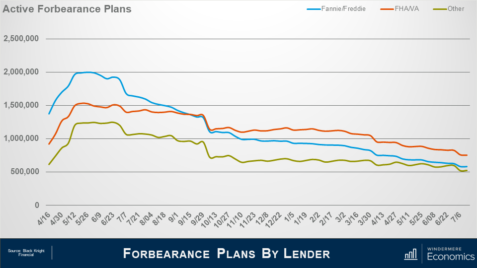
And as you can see from this first chart, the situation today is a vast improvement from where we were last May when there were more than 4.76 million homes in the program. For context, that meant that more than 9% of all homes with a mortgage were in the program last May – a huge number.
But the latest data from Black Knight Financial shows that – by mid-July of this year – the number had dropped to just over 1.86 million homes, or roughly 3.5% of houses with a mortgage.
This is certainly a pretty impressive recovery, as it means that 2.9 million homeowners left the program between May of 2020 and mid-July 2021.
And when we look at the makeup of mortgages in forbearance, the largest share came from loans backed by Fannie Mae and Freddie Mac – not surprising given the size of their mortgage portfolio – with, at the peak, just shy of two million homes in the program – roughly 7.2% of their total portfolio.
But that number has now dropped to 582,000 or just 2.1% of loans outstanding.
Loans backed by the FHA or VA also peaked last May at about 1.53 million or 12.6% of their portfolio.
But today that number has dropped to 755,000 or 6.2% of the mortgages they hold.
And finally, loans showed here as “other” represent private label securities or portfolio loans, and it’s interesting to see that their numbers didn’t peak until late June when just short of 1.25 million homes – or 9.6% of their portfolio – were in the program.
However, today that number had dropped to 524,000, or 4% of mortgages backed by these entities.
What I see from the slides that we have looked at is that the number of active forbearance plans continues to fall; however, the pace of the drop has certainly slowed over the last quarter or so.
After seeing a monthly drop of 12% in April – as a large volume all plans hit their 12-month review date – the pace of improvement has since slowed to just 5% over the past 30 days.
Although the number of homes in forbearance is still higher than I would like to see, fewer than 4% of all mortgages are in the program and we haven’t seen this level since April of 2020, just as the pandemic was kicking in.
As we look forward, you can see that almost 600,000 homes currently in forbearance are coming up for review so the potential for a greater rate of improvement in the overall number of homes in the program is certainly possible – but not guaranteed.
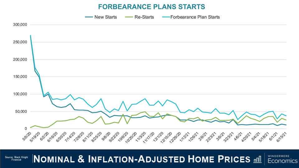
Unsurprisingly the number of homes entering the program for the first time as well as repeat plan starts is lower than we saw last summer but again the pace of improvement has slowed. That said, overall starts are down by 3% on the month and when we combine new and repeat starts the number is 3 to 4% lower.
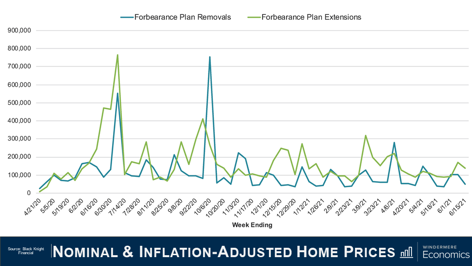
Of the roughly 460,000 homes in forbearance that were reviewed for either extension or removal from the program in the first two weeks of June, 33% left the program while 67% had the term extended. This is a lower removal rate than we saw during the first two weeks of either April or May, but I expect to see more homeowners come out of the program, but only as long as the country continues to reopen, and that is not a certainty given the rise of the Delta and Lambda variants of the COVID-19 virus.
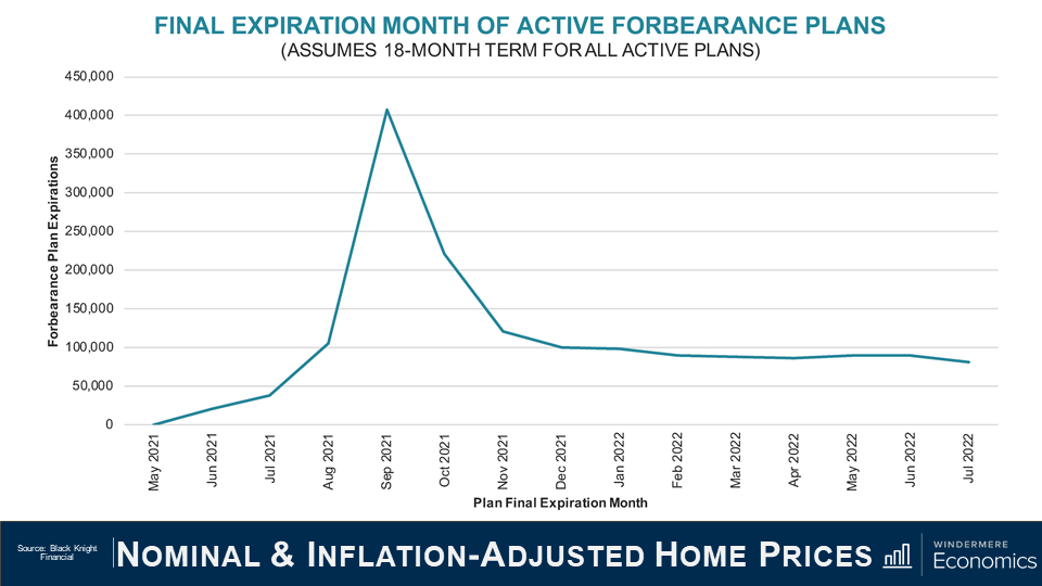
I actually found this chart to be very interesting. Of the more than two million active forbearance plans, approximately half are scheduled to reach their 18-month terminal expiration date in September and October of this year.
And if we take this data, and then project a fairly modest 3% monthly rate of homeowners leaving the forbearance program, it means that over 900,000 homes would exit the program in the third and fourth quarters of this year.
And with 575,000 thousand plans scheduled to expire in September and October alone – that means that mortgage services will be faced with the daunting task of having to process nearly 15,000 plans per business day during that time. It’s going to be a lot of work!
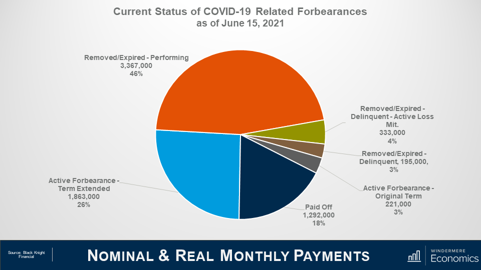
Roughly 7.25 million borrowers have used the forbearance program at one time or another through the course of the pandemic and that represents roughly 14% of all homeowners in the country.
Of that 7.25 million, the chart here shows that 72% have left the plan, and 28% remain in active forbearance, but you can also see that loan performance remains pretty robust among homeowners who have left the program with 46% of them getting things squared away with their lenders in regard to missed payments, and 18% having paid off their loan in full – likely from selling or refinancing with a different lender.
You will also see that the number of borrowers in post forbearance loss mitigation is down a tad to 333,000, while those who have left forbearance but still remain delinquent and not in loss mitigation accounts for roughly 3% of total loans in the program or just 195,000.
So, the way I see it, although the number of homes leaving the program has certainly slowed which, quite frankly, doesn’t surprise me, I still expect further improvement as we move through the year not just because the economy continues to reopen and people are getting reestablished at work, but also because we won’t be seeing any new owners enter the program.
And finally, I want to show you what parts of the country have a high share of homes in forbearance.
I must tell you first off, that this data isn’t that timely – in fact these numbers are from March as the data I get at the State and County grain is subject to a three month lag.
Anyway, as you can see from this map, not all states are created equal, with the share of homes in forbearance still elevated in Louisiana, Texas and, to a lesser degree, New York State.
Out here in the West, the rate in Nevada is still high, and California and New Mexico are both somewhat higher than I would like to have seen but, as I just said, this data is a little old, and I believe that the share of homes in forbearance in both Nevada and California is lower today than you see here.
Given everything that we’ve looked at today, there are a couple of conclusions that can be drawn.
The first, and most obvious, is that anyone believing but there will be a flood of homes that will be foreclosed on either toward the end of this year or in 2022, is likely to be disappointed. Even if every home still in the program does enter foreclosure which, by the way, is basically impossible, the number of homes that would be foreclosed on would be minimal when compared to the fallout following the financial crisis of more than a decade ago.
And when I say that it’s virtually impossible to expect to see all homes will be foreclosed on, it’s mainly because of the remarkable run up in home values that the country has seen since 2012.
The buildup of equity that all homeowners have seen whether they bought before 2012, or even as recently as the past 2 or 3 years, suggests that if, for whatever circumstance, owners in forbearance can’t get their heads back above water, they will choose to sell their home – in order to keep the equity that they have accumulated.
A typical homeowner in forbearance has a sizeable equity in their home, with median equity of a homeowner in the program measured at just over $100,000. And this significant amount of cash in their homes would allow them to pay the bank back any missed payments, sell, and still walk away with a sizable amount of equity.
The bottom line is that have the forbearance program was needed and it can be said that it has been successful so far in warding off home foreclosures because of the remarkable impact of the pandemic.
Although it would be naïve to suggest that foreclosure rates won’t rise at all, as the forbearance program winds down, I do see them ticking higher but, given all the data that I’ve been looking at, I would be very surprised to see overall foreclosure rates rise to a level significantly above the long-term average.
Well, I hope that you have found this month’s discussion to be interesting. As always if you have any questions or comments about this topic, please do reach out to me but, in the meantime, stay safe out there and I look forward the visiting with you all again, next month.
The following analysis of the Western Washington real estate market is provided by Windermere Real Estate Chief Economist Matthew Gardner. We hope that this information may assist you with making better-informed real estate decisions. For further information about the housing market in your area, please don’t hesitate to contact your Windermere Real Estate agent.
REGIONAL ECONOMIC OVERVIEW
Employment levels in Western Washington picked up in the late spring and early summer months. The region has now recovered 168,800 of the 297,210 jobs that were lost due to the pandemic. Although the recovery is palpable, there are still 128,000 fewer jobs than there were at the pre-COVID peak in February 2020. The most recent data (May) shows the region’s unemployment rate at a respectable 5.2%. This is significantly lower than the April 2020 high of 16.8%, but still not close to the 2020 low of 3.7%. The jobless rate was lowest in King County (4.8%) and highest in Grays Harbor County (7.6%). Although unemployment levels continue to drop, we cannot attribute all the improvement to job creation: a shrinking labor force also lowers the jobless rate. In short, job recovery continues but we still have a way to go.
WESTERN WASHINGTON HOME SALES
❱ Regardless of low levels of supply, sales in the second quarter rose 45.6% year-over year, with a total of 25,640 homes sold. Although comparisons to the same quarter a year ago are not informative due to the pandemic, I was pleased to see sales increase 61.3% from the first quarter of this year.
❱ Listing activity was 42.8% higher than in the first quarter, which was a pleasant surprise. Listings rose the most in Kitsap, Clallam, Island, and Mason counties, but there were solid increases across the region.
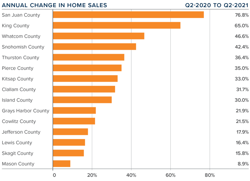
❱ Sales were up across the board, with sizable increases in San Juan, King, Whatcom, and Snohomish counties. Only Mason County experienced sales growth below 10%.
❱ Pending sales (demand) outpaced active listings (supply) by a factor of 6. Even with the increase in the number of homes for sale, the market is far from being balanced.
WESTERN WASHINGTON HOME PRICES
❱ Home prices rose 31.4% compared to a year ago. The average sale price was $734,567—another all-time record.
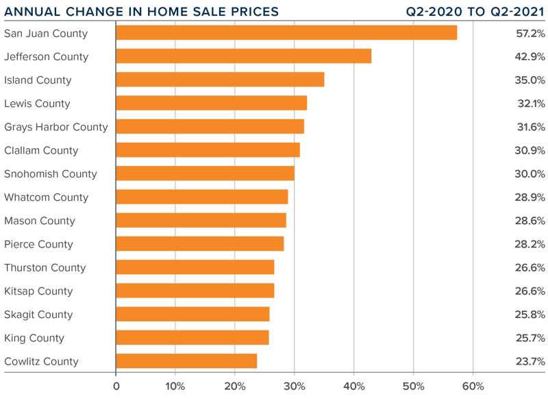
❱ Year-over-year price growth was strongest in San Juan and Jefferson counties, but all markets saw prices rise more than 23% from a year ago.
❱ Home prices were a remarkable 15.7% higher than in the first quarter of this year, possibly due in part to the drop in 30-year fixed mortgage rates between the end of the first and second quarters. That said, the modest decline in mortgage rates is certainly not the primary driver of price growth; the culprit remains inadequate supply.
❱ Relative to the first quarter of the year, San Juan (+33%), Jefferson (+24.7%), and Island (+20.5%) counties saw the fastest rate of home-price appreciation.
DAYS ON MARKET
❱ It took an average of only 18 days for a listed home to go pending. This was 22 fewer days than a year ago, and 11 fewer days than in the first quarter of 2021.
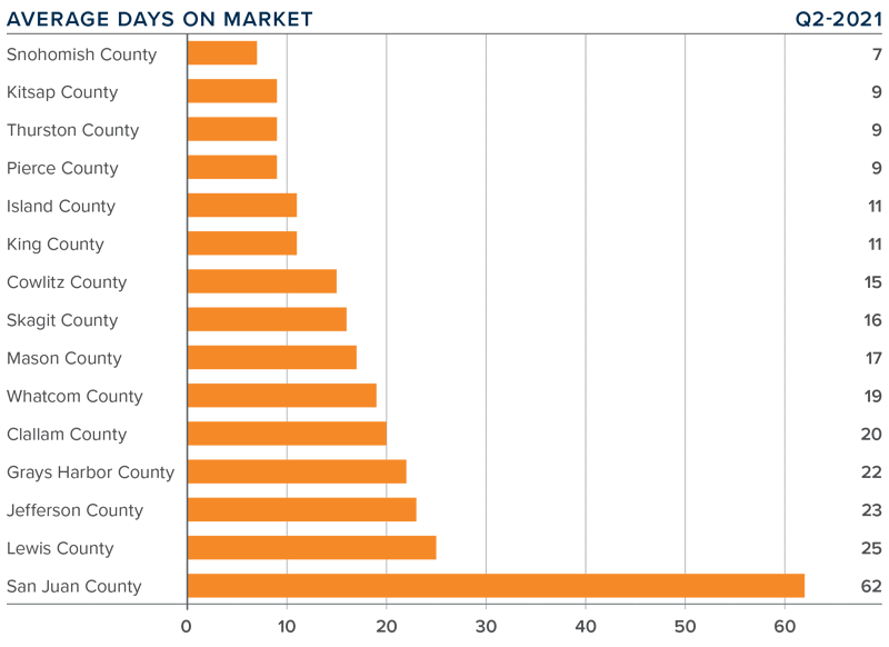
❱ Snohomish, Kitsap, Thurston, and Pierce counties were the tightest markets in Western Washington, with homes taking an average of only 7 days to sell in Snohomish County and 9 days in the other three counties. The greatest drop in market time compared to a year ago was in San Juan County, where it took 84 fewer days to sell a home.
❱ All counties contained in this report saw the average time on market drop from the same period a year ago. The same can be said when comparing market time in the current quarter with the first quarter.
❱ It’s widely known that the area’s housing market is very tight and unfortunately, I don’t expect the number of listings to increase enough to satisfy demand in the near term. Furthermore, I’m seeing rapid growth in demand in the counties surrounding King County which is likely proof that buyers are willing to move further out given the work-from-home paradigm shift.
CONCLUSIONS
This speedometer reflects the state of the region’s real estate market using housing inventory, price gains, home sales, interest rates, and larger economic factors.
Demand is maintaining its momentum, and, even with supply levels modestly improving, the market remains extraordinarily tight.
Mortgage rates are still hovering around 3%, but the specter of them starting to rise at some point is clearly motivating buyers. I am very interested to see significant interest outside of the Seattle metro area, although King County is certainly still performing well. I will be monitoring whether this “move to the ‘burbs” is endemic, or a temporary phenomenon. My gut tells me that it is the former.
At some point, the remarkable run up in home values will slow. Affordability constraints are becoming more widespread, and even a modest uptick in mortgage rates will start to slow down price increases. It’s worth noting that list-price growth is starting to taper in some markets. This is a leading indicator that may point to a market that is starting to lose a little momentum.
The bottom line is that the market still heavily favors sellers and, as such, I am moving the needle even more in their favor.
ABOUT MATTHEW GARDNER
As Chief Economist for Windermere Real Estate, Matthew Gardner is responsible for analyzing and interpreting economic data and its impact on the real estate market on both a local and national level. Matthew has over 30 years of professional experience both in the U.S. and U.K.
In addition to his day-to-day responsibilities, Matthew sits on the Washington State Governors Council of Economic Advisors; chairs the Board of Trustees at the Washington Center for Real Estate Research at the University of Washington; and is an Advisory Board Member at the Runstad Center for Real Estate Studies at the University of Washington where he also lectures in real estate economics.
Originally published on the Windermere Blog by Sandy Dodge
Of all the questions that arise during the selling process, “What’s my home worth?” is the first for most sellers. By using home valuation tools and understanding local market conditions, sellers can educate themselves on how much their home could potentially fetch on the market, but that’s just the tip of the iceberg.
Best Ways to Determine Home Value
Windermere’s home value estimator is a great starting point for sellers. Free to use, it will provide you with an instant home value and an expected price range, a heat map of buyer interest near you, and recent home sales in your area. Click the link below to get started.
Though tools like home value estimators provide some data on what sellers can expect when pricing their home, nothing compares to the expertise a professional real estate agent offers. Various factors influence home prices including seasonality, market conditions, and location, and agents have the means to account for these factors to accurately price your home by conducting a Comparative Market Analysis (CMA).
A CMA compares your home to others in your area that have either recently sold, are currently on the market, or had previously listed but have since expired. Depending on the conditions of the market, an agent will gather data for the past three to six months. When conducting a CMA, they’ll take into account recent market trends, competing properties, your home’s amenities, and its overall marketability. The analysis also considers aspects of the home such as lot size, condition, age, square footage, bedrooms and bathrooms, and the terms of financing. A thorough CMA will provide information on what homes in your area are selling for, how long they were on the market, and the difference between their listed and sold price.
So why is a CMA important? A CMA helps price the home more accurately, keeping the property competitive in the current market. For example, in a seller’s market where demand is driving up home values, an agent will work with their seller to account for the elevated prices before listing their home. Doing so allows you to avoid overpricing which usually results in a longer sale period. CMAs can also help buyers negotiate their asking price by having a data-backed analysis of the home’s value based on current market trends.
The key to a successful sale begins with pricing your home correctly, and having an experienced agent conduct a Comparative Market Analysis is critical to this process. I’d love to help you start this process and provide you with a free CMA for your home, feel free to send me an email and we can get the process started.
Originally posted on the Windermere Blog by Sandy Dodge
Navigating everything involved with selling your home can seem intimidating. Breaking the process down step by step will keep you organized and ready to work with your agent toward a successful home sale.
1. Choose an agent
A lot goes into choosing the right agent. If you’re unsure where to start, get referrals from trusted friends, family, and neighbors. Although the ultimate goal is the sale, think about your compatibility outside of the transaction. Their ability to connect with you on a human level through the ups and downs of a home sale is just as important as their expertise and knowledge of the market.
2. Set a timeline
Depending on your local housing market conditions, your timeline for selling your home may vary. However, a timeline is valuable in that it will keep you organized throughout the selling process and allows you to adjust if circumstances change. Your agent will work with you to build the ideal timeline.
3. What is your home worth?
The key to selling quickly is correctly pricing your home from the first day it hits the market. In particular, overpricing can lead to serious complications in the selling process. Your agent can provide you with a Comparative Market Analysis (CMA) to better determine the best price of your home. CMAs provide information on comparable home sales in your area, both pending and sold, within the past six months.
While an agent will always have the best information, you can also try our automated value estimate tool as a starting point. Our seller page features home values and market information about what buyers are looking for in your area.
4. Repair & upgrade
Now it’s time to get to work on the house! This is the perfect time to tackle any and all outstanding projects or repairs. Create a list separating which repairs can be done yourself and which need professional attention. This is the time to consider a pre-sale home inspection to identify structural and mechanical problems before your home is on the market.
5. Make the best first impression
Making an impactful first impression goes a long way in the minds of buyers, so roll up your sleeves and prepare to check off that to-do-list. Start by cleaning up the garden and lawn, clearing out gutters, and adding color to your flower beds. Apply a fresh coat of paint anywhere you spot peeling or cracked paint. A great way to make an impact is by staging your home, with the goal of making each room feel as spacious and welcoming as possible.
6. Show your home
Your local pandemic-era regulations will dictate the ability for agents to conduct in-person showings and open houses. Discuss virtual home tour options with your agent and other ways to generate maximum buyer interest. For in-person showings, it’s best that you leave the premises so the buyer can freely ask their agent questions and visualize the home as their own.
7. Offers & negotiation
If you are in a seller’s market—defined by low inventory and high buyer competition—it is likely that you will receive offers at – or above – asking price. You can respond to an offer by a) accepting the offer, b) making a counteroffer, or c) rejecting the offer. Counteroffers should always be made in writing and provide a short window of time for the potential buyer to respond. If you are selling in a buyer’s market, you may have to be more open to negotiation. Discuss negotiation strategies with your agent to work toward a satisfying final price.
8. Prepare for closing costs
There are costs throughout the selling process, and as the close date approaches, that remains true. Be sure to budget for your real estate agent’s commission, and other common seller’s costs like title insurance, recording fees, and government transfer tax, among others.
9. Home inspection
Buyer offers are usually contingent upon a professional home inspection. Ask your agent for a home inspection checklist, so you know what the inspector is looking for ahead of time. They typically inspect the home’s foundation, structure, roof, plumbing and electrical systems, floors, windows, doors, and more for signs of damage and weathering.
10. Closing time
Congratulations! Your home is sold, but there are still some final steps before the deal is done. This is the time to ask the buyer to release any contingencies, sign the title, and close escrow before handing over the keys. Consult your real estate agent for any questions about legal documentation and settlement costs.
If you’d like more information about selling your home, I’m ready to help. Click here to connect.
This video is the latest in our Monday with Matthew series with Windermere Chief Economist Matthew Gardner. Each month, he analyzes the most up-to-date U.S. housing data to keep you well-informed about what’s going on in the real estate market.
Hello! I’m Matthew Gardner, Chief Economist for Windermere Real Estate and welcome to this latest edition of Mondays with Matthew.
Before I get going with this months’ discussion, I did want to thank you for all the very gracious comments I received following last month’s video when I offered my views regarding the rumor that’s circulating about a new housing bubble forming.
Well, today we’re going to stay inside the same broad topic, but this time we will be focusing on why home prices have been able to rise at such a significant pace over recent years but—more importantly—I’m going to share my analysis showing that, in reality, home prices are actually not as high as they appear on face value!
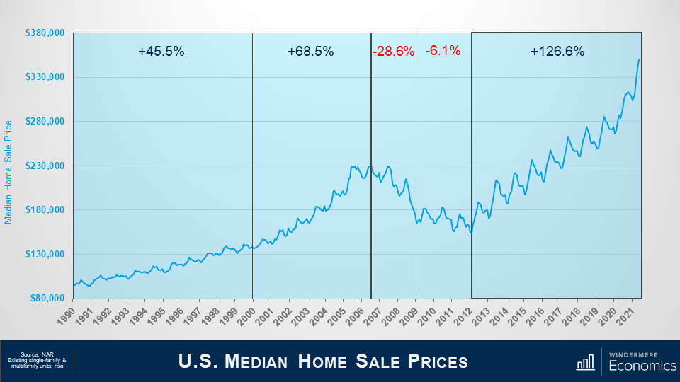
For context, let’s look at home prices over the past three decades and this chart shows the median sale price of existing homes—both single-family and multifamily—over time.
In the 1990’s – prices rose by over 45%.
And this was followed by a significantly faster pace of appreciation as the housing bubble was really getting inflated—with prices soaring by over 68% between the start of the decade and its ultimate peak in the summer of 2006.
Well, we all remember what happened then! The bubble burst, with prices dropping by almost 29% between July 2006 and early 2009.
This was followed by a brief period of relative stability—due to the introduction of the first-time homebuyer buyer tax credit—but, as the impacts of that stimulus wore off, prices dropped further, bottoming out in January of 2012—32.9% below the pre-bubble peak.
But, from 2012 until today, sale prices have shot up by more than 126%—a remarkable number—and I would add that prices are up by over 42% since the end of 2017; 37.5% since 2018; and 27.6% since the start of this decade.
Interestingly, well, interesting to me at least, the number of homes sold actually bottomed out in 2010—well before prices hit their low point. And this was because a lot of buyers got into the market for one primary reason: home prices were cheap! So cheap, in fact, that back then you could actually buy a home in many markets for less than it would cost to build the very same home.
Now, given the pace of price growth that we have seen since the 2012 trough, I’m really not at all surprised to hear rumblings regarding bubbles. But is this really the case?
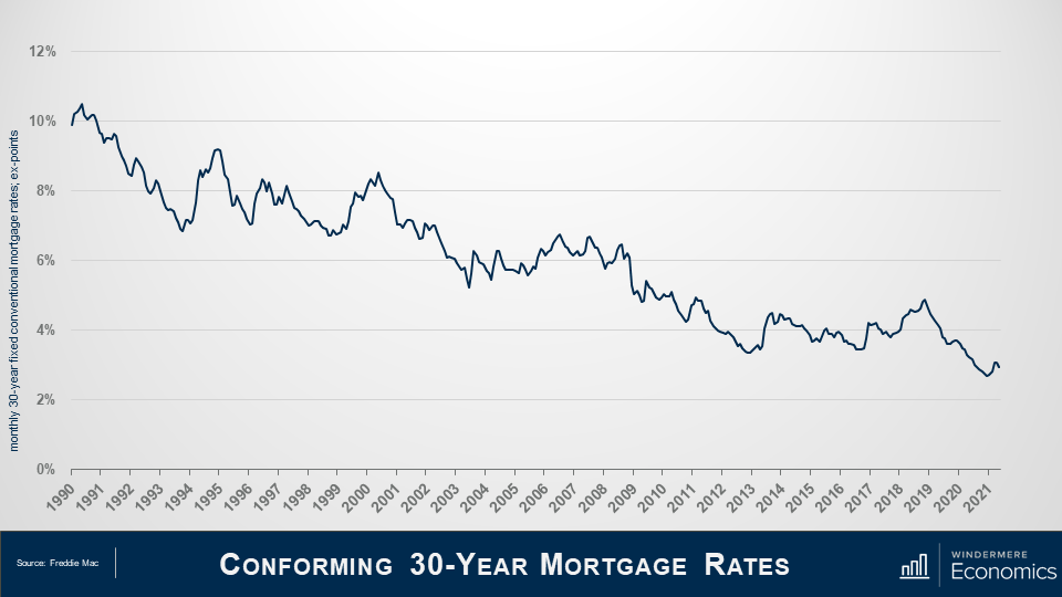
Let’s take a peek at what had been going on with mortgage rates over the same time period.
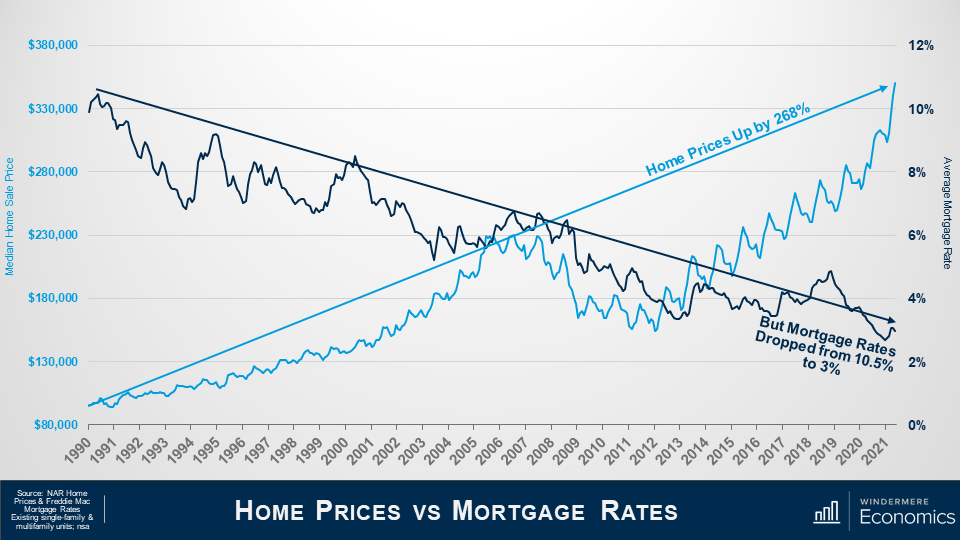
As home prices were rising, what were mortgage rates doing? That’s right! They were falling. Of course, there were some periods where rates trended higher—most recently in 2018—but I really want you to look at the overall direction of rates over the last 30 years. They’ve been heading in one direction and that’s down.
So! What happens when we overlay sale prices with mortgage rates?
Here are the sale prices we looked at earlier.
And here are mortgage rates.
Prices are up by almost 270% over the past three decades.
But in the same time period, mortgage rates have fallen from over 10% to around 3%. And it is this massive drop in rates that, over the long-term, allowed buyers to finance more expensive homes and this, naturally, has led prices higher.
And this is a part—just a part mind you—of the reason why prices have been able to rise so significantly.
So! Prices have risen almost threefold as the cost to finance a home has dropped by 72%.
But that’s not the whole story.
You see, it’s not accurate to simply look at the change in home prices over time without considering inflation, and the impacts here are very significant.
Inflation plays a substantial part in understanding prices of any commodity, and that certainly includes housing.
But before we dig into this part of the discussion, I have to give a shout out to Bob Shiller—of the famed Case-Shiller Index—who I believe was the first person to have written about the relationship between housing and inflation in his book “Irrational Exuberance” and whose work I used as a foundation for these next few slides.
So, if you are wondering what inflation has to do with home prices, I will tell you. Just like other goods and services, the price of a house today is not directly comparable to the price of that same house 30 years ago, because of the long-run influence of inflation.
For example, in 2020, the median sales price of a home was almost $297,000. That is 14 times the average sales price in 1968 – which was just over $20,000!
That might sound terrible, but back in 1968, the median household income was $7,700 a year, a gallon of gas set you back around 33 cents, and you could buy a dozen eggs for 53 cents.
And it’s because of this that we need to look at inflation adjusted home prices simply because the value of money changes over time.
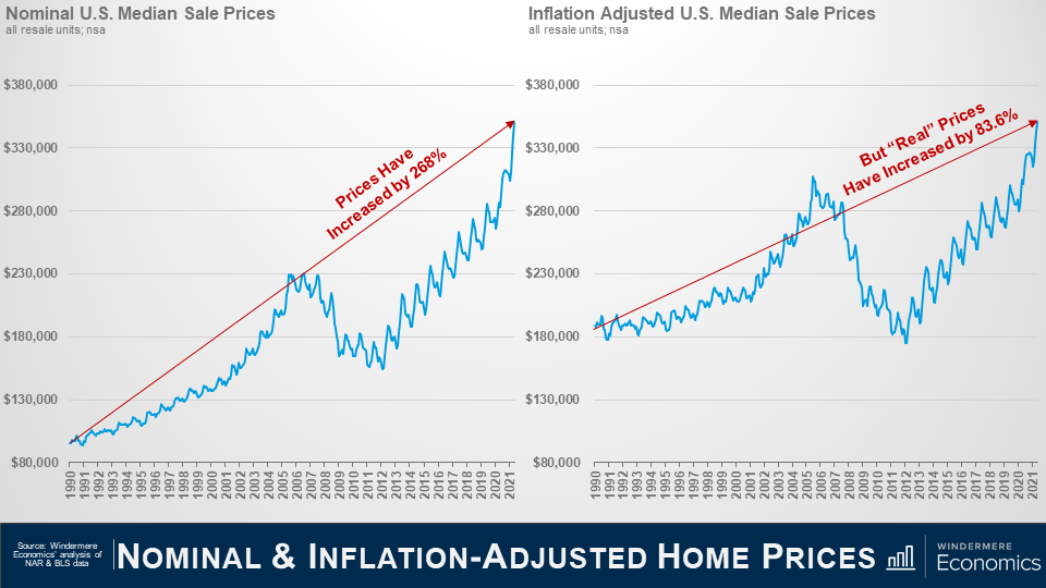
This slide shows nominal median sale price over time—its chart we started out with. And when I use the term “nominal”, it means that it’s not adjusted for inflation and therefore the value of each dollar spent on housing was actually depreciating over time because of inflation.
And we know that prices are up by 268% over the past 30+ years—a very significant increase. But what happens when you adjust sale prices to account for inflation?
That’s right! Real prices are certainly higher, but by a more modest 83.6%.
So, we know that prices are higher than they were three decades ago but, in reality, the real increase is significantly lower than most people are talking about today.
The compounded annual growth rate—unadjusted for inflation—was over 4%; but when you adjust for inflation, the REAL rate was just 2%.
But there’s another factor which we need to consider when we are thinking about home price growth, so now we need to bring mortgage rates back into the equation.
I know we’ve already discussed the fact that rates dropping helped prices to rise at well above the long-term average, but now we need to look at what happens to mortgage “payments” when we use inflation-adjusted home prices.
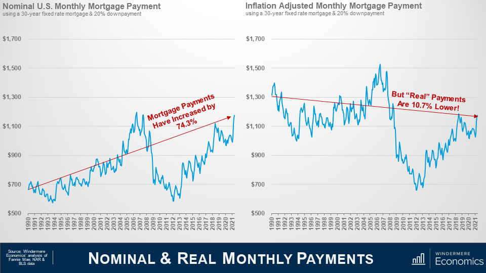
For comparison purposes, you are looking at the monthly mortgage payment for a median priced home in the US—using the average conventional mortgage rate during that month and assuming a 20% down payment.
From 1990 until today, P&I (principal & interest) payments are up by a bit more than 74%.
Of course, I am sure that there are some of you out there again crying “foul” because I am using a high downpayment but, in reality, it really makes no difference to the percentage increase in payments. You see, whatever the downpayment a buyer uses, the percentage change is actually the same.
Anyway, monthly P&I payments—in nominal terms—have risen by 74.3% BUT, what happens when you use the same mortgage rates, but to buy a home where the value has been adjusted to account for inflation?
That’s right…. “Real”—or inflation-adjusted mortgage payments—are almost 11% LOWER today than they were back in 1990 and, as you can see, significantly lower than they were during the” bubble” days”.
Now I fully understand that this is not a perfect analysis.
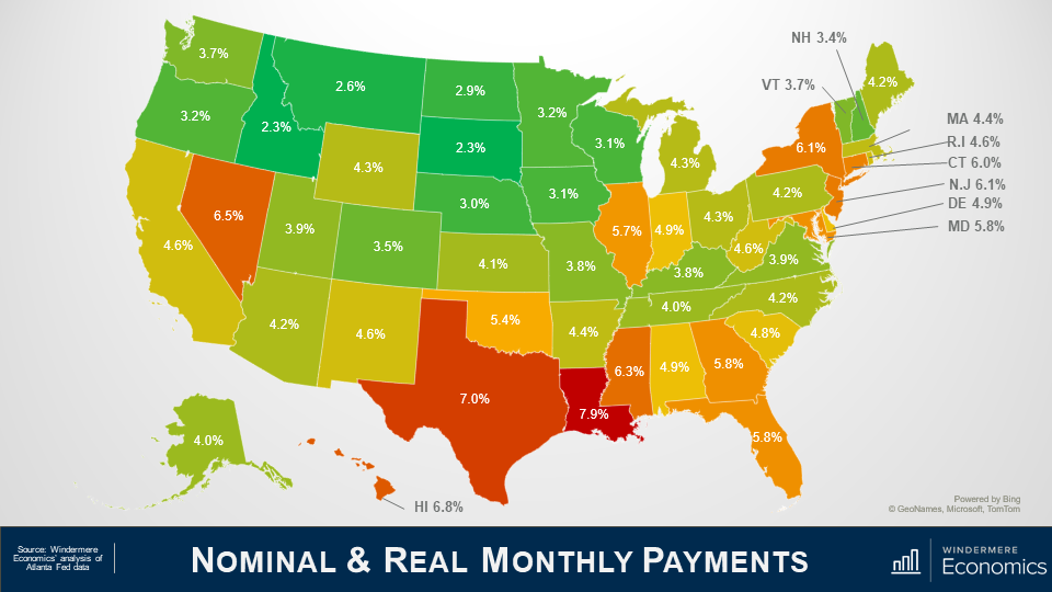
Monthly housing costs don’t just include mortgage payments, but they also include property taxes and insurance, both of which—unfortunately—don’t fall even if mortgage rates do!
Additionally, it does not address prices changes due to over or undersupply in any one market, and it also can’t address the impacts of changing lending policies.
But, that said, I stand by my belief that prices have been able to rise so significantly because mortgage rates have dropped AND because inflation-adjusted house prices really haven’t skyrocketed—contrary to popular opinion.
But, of course, all real estate is local, and although the numbers I’ve shared with you today might be comforting when you read articles from the “bubble-heads” out there, I must tell you that there are some markets across the country where the picture isn’t quite as rosy.
In these areas prices have risen significantly more than the national average so, even when you adjust sale prices for inflation, mortgage payments are a lot higher today than they were three decades ago.
And it is these markets that will be impacted when mortgage rates start to trend higher—which they surely will—and growing affordability constraints further limit the number potential buyers.
The bottom line is, as far as I am concerned, there are quantifiable reasons to believe that we are not in a national housing bubble today, but some markets will experience a significant slowdown in price growth given where prices are today in concert with the specter of rising mortgage rates.
So! there you have it.
I certainly hope that you found this topic as interesting as I do!
As always, if you have any questions or comments about inflation and home values, I would love to hear from you but—in the meantime—stay safe out there, and I look forward to talking to you all again, next month.

 Facebook
 X
X
 Pinterest
 Copy Link